Solution
To create ant design card with dropdown in react js, first install ant design library using npm install antd command import and use the Card component from it. You have to use Dropdown component with card.
Snippet
In this snippet, see a small example of using the Card component of the Ant design library, with the use of title="Card title" attribute. then use the dropdown component.
<Card title="Card Title" style={{ width: 300 }}>
    <Dropdown overlay={menu}>
    <a className="ant-dropdown-link" onClick={(e) => e.preventDefault()}>
          Dropdown <DownOutlined />
      </a>
    </Dropdown>
    <p>Card content</p>
    <p>Card content</p>
    <p>Card content</p>
</Card>
Table of contents
- Install Ant Design.
- Import Ant Design Components..
- Define the custom style.
Let’s start with the first step.
Step 1: Install Ant Design.
To get started, first you need to install Ant Design in your React project. So that you can run the following command in your terminal:
npm install antd
Step 2: Import Ant Design Components.
You need to import the Ant Design components that you want to use in your project. To create a card, you need to import the Card component from Ant Design. You can do this by adding the following code to your React component:
import React from "react";
import { Card, Dropdown, Menu } from "antd";
import { DownOutlined } from "@ant-design/icons";
Step 3: Define the custom style.
This code creates a React for the Card component with The card component is used to create Card and Dropdown component is used to create Dropdown.
<Card title="Card Title" style={{ width: 300 }}>
    <Dropdown overlay={menu}>
    <a className="ant-dropdown-link" onClick={(e) => e.preventDefault()}>
          Dropdown <DownOutlined />
      </a>
    </Dropdown>
    <p>Card content</p>
    <p>Card content</p>
    <p>Card content</p>
</Card>
Example
In this example, we will import the Card component from the ant library. Use the Card component from Ant Design to create the Card and Dropdown components. Menu prop is such a prop in which you can write the list you want to appear in the dropdown.
Let’s start coding…
App.js
import React from "react";
import { Card, Dropdown, Menu } from "antd";
import { DownOutlined } from "@ant-design/icons";

const menu = (
  <Menu>
    <Menu.Item key="1">Option 1</Menu.Item>
    <Menu.Item key="2">Option 2</Menu.Item>
    <Menu.Item key="3">Option 3</Menu.Item>
  </Menu>
);

const App = () => {
  return (
    <Card title="Card Title" style={{ width: 300 }}>
      <Dropdown overlay={menu}>
        <a className="ant-dropdown-link" onClick={(e) => e.preventDefault()}>
          Dropdown <DownOutlined />
        </a>
      </Dropdown>
      <p>Card content</p>
      <p>Card content</p>
      <p>Card content</p>
    </Card>
  );
};

export default App;
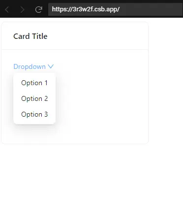
Output
Links
Here, we are provided code sandbox links for the above program to create ant design card with dropdown in react js. Then you can use whenever you went and do the changes as per your requirements
Happy Coding,
I hope the above example with help you to do your task.