Solution
To create ant design carousel with arrows in react js, first install ant design library using npm install antd command import carousel component from it. Use the prevArrow and nextArrow props to set the arrow in the Carousel.
Snippet
In this snippet, see the short example to use Carousel component of ant design library, with the use Array function and <div> element set in <h3>1</h3>.
<Carousel arrows {...settings}>
  <div>
      <h3>1</h3>
        </div>
        <div>
          <h3>2</h3>
        </div>
        <div>
          <h3>3</h3>
        </div>
        <div>
          <h3>4</h3>
        </div>
      </Carousel>
Table of contents
- Install Ant Design.
- Import Ant Design.
- Create the Carousel Component.
- Add Arrows to the Carousel.
Let’s start with the first step.
Step 1: Install Ant Design.
install ant design library using npm install antd command.
Step 2: Import Ant Design.
You can import the Checkbox component from Ant Design.
and import icon in "@ant-design/icons" labrerary.
import { Carousel } from "antd";
import { LeftOutlined, RightOutlined } from "@ant-design/icons";
Step 3: Create the Carousel Component.
we can use arrows {...settings} then create carousel arrows.
<div style={{ padding: "50px" }}>
  <Carousel arrows {...settings}>
    <div>
      <h3>1</h3>
    </div>
    <div>
      <h3>2</h3>
    </div>
    <div>
      <h3>3</h3>
    </div>
    <div>
      <h3>4</h3>
    </div>
  </Carousel>
</div>
Step 4: Add Arrows to the Carousel.
We use prevArrow and nextArrow props of the Slider component to add arrows to the carousel.
const settings = {
  nextArrow: <SampleNextArrow />,
  prevArrow: <SamplePrevArrow />
};
Example
In this example, we will import the Carousel component from the ant library. autoplay in carousel is used for automatic sliding. Inside the carousel component, we add the Slider component, and pass in the settings object.
Let’s start coding…
App.js
import React from "react";
import "./App.css";
import { Carousel } from "antd";
import { LeftOutlined, RightOutlined } from "@ant-design/icons";

const SampleNextArrow = (props) => {
  const { className, onClick } = props;
  return (
    <RightOutlined
      style={{ fontSize: "20px", color: "#000" }}
      className={className}
      onClick={onClick}
    />
  );
};

const SamplePrevArrow = (props) => {
  const { className, onClick } = props;
  return (
    <div className={className}>
      <LeftOutlined
        style={{ fontSize: "20px", color: "#000" }}
        onClick={onClick}
      />
    </div>
  );
};

const settings = {
  nextArrow: <SampleNextArrow />,
  prevArrow: <SamplePrevArrow />
};

const myCoursel = () => {
  return (
    <div style={{ padding: "50px" }}>
      <Carousel arrows {...settings}>
        <div>
          <h3>1</h3>
        </div>
        <div>
          <h3>2</h3>
        </div>
        <div>
          <h3>3</h3>
        </div>
        <div>
          <h3>4</h3>
        </div>
      </Carousel>
    </div>
  );
};

export default myCoursel;
.ant-carousel .slick-slide {
 text-align: center;
 height: 160px;
 line-height: 160px;
 background: #364d79;
 overflow: hidden;
}

.ant-carousel .slick-slide h3 {
  color: #fff;
}
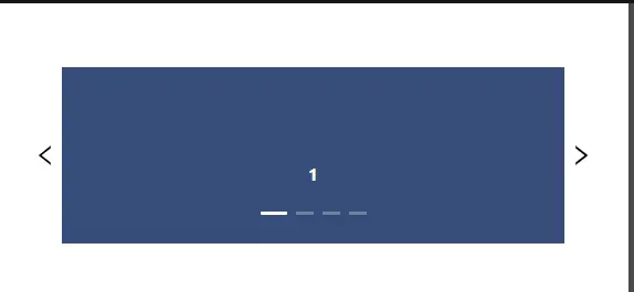
Output
Links
Here, we are provided code sandbox links for the above program to create ant design carousel with arrows. Then you can use whenever you went and do the changes as per your requirements
Happy Coding,
I hope the above example with help you to do your task.