Solution
To create checkbox in group using ant design in react js, you can use the checkbox component, and use this code <Checkbox.Group/> then it will create a group of checkbox.
Snippet
In this snippet, see the short example to How can use checkbox group in ant design.
  <Checkbox.Group options={plainOptions}
      defaultValue={['Apple']}
      onChange={onChange}
    />
    <br />
    <br />
    <Checkbox.Group options={options}
      defaultValue={['Pear']}
      onChange={onChange}
  />
Table of contents
- Install Ant Design.
- Import the necessary components.
- Define options.
- Create a group of checkboxes.
Let’s start with the first step.
Step 1: Install Ant Design.
install ant design library using npm install antd command.
Step 2: Import the necessary components.
you can import the Checkbox component from Ant Design.
import { Checkbox } from 'antd';
Step 3: Define options.
You have a need to define the checkbox group using the array. The plainOptions array is a simple array, it will create apple, pear, orange.
const plainOptions = ['Apple', 'Pear', 'Orange'];
const options = [
  {
    label: 'Apple',
    value: 'Apple',
  },
  {
    label: 'Pear',
    value: 'Pear',
  },
  {
    label: 'Orange',
    value: 'Orange',
  },
];
Step 4: Create a group of checkboxes.
The options prop basically the options for the checkbox group, which in this case is the plan options array. and set the default value on apple.
<Checkbox.Group options={plainOptions}
  defaultValue={['Apple']}
  onChange={onChange}
/>
Example
In this example, first, install ant design library using npm install antd command. you will import the Checkbox component from the ant library. use Checkbox.Group component of ant design library, and pretends to be the plainOptions and options arrays with checkboxes.
Let’s start coding…
App.js
import { Checkbox } from 'antd';

const onChange = (checkedValues) => {
  console.log('checked = ', checkedValues);
};
const plainOptions = ['Apple', 'Pear', 'Orange'];
const options = [
  {
    label: 'Apple',
    value: 'Apple',
  },
  {
    label: 'Pear',
    value: 'Pear',
  },
  {
    label: 'Orange',
    value: 'Orange',
  },
];

const App = () => (
  <>
    <Checkbox.Group options={plainOptions}
      defaultValue={['Apple']}
      onChange={onChange}
    />
    <br />
    <br />
    <Checkbox.Group options={options}
      defaultValue={['Pear']}
      onChange={onChange}
    />

  </>
);
export default App;
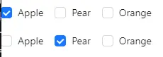
Output
Links
Here, we are provided code sandbox links for the above program to create checkbox in group using ant design. Then you can use whenever you went and do the changes as per your requirements
Happy Coding,
I hope the above example with help you to do your task.