Solution
To make ant design autocomplete with multiple selection options in react js, first install the ant design library using the npm install antd command and then import and use the Select component with the mode attribute with the multiple value.
Snippet
In this snippet, see the short example of dropdown with multiple selection options.
 <Select
  mode="multiple"
  allowClear
  style={{
    width: '100%',
  }}
  placeholder="Please select"
  defaultValue={['a10', 'c12']}
  onChange={handleChange}
  options={options}
/>
Example
In this example, we will import Select and Space from antd library, with in Space component with space setting i will write Select component with mode="multiple" option.
Let’s start coding…
App.js
import { Select, Space } from 'antd';
const options = [];
for (let i = 10; i < 36; i++) {
  options.push({
    label: i.toString(36) + i,
    value: i.toString(36) + i,
  });
}
const handleChange = (value) => {
  console.log(`selected ${value}`);
};
const App = () => (
  <Space
    style={{
      width: '100%',
    }}
    direction="vertical"
  >
    <Select
      mode="multiple"
      allowClear
      style={{
        width: '100%',
      }}
      placeholder="Please select"
      defaultValue={['a10', 'c12']}
      onChange={handleChange}
      options={options}
    />

  </Space>
);
export default App;
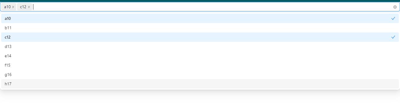
Output
Links
Here, we are provided code sandbox links for the above program make ant design autocomplete with multiple selection option. Then you can use whenever you went and do the changes as per your requirements.
Happy Coding,
I hope the above example with help you to do your task.