Solution
To use media query in styled components, you can use @media syntax in styled CSS. check out the below Snippet and Example.
Snippet
In this snippet, we will see how to use media query in styled components and when we will use media query displaying min-width: 768px.Then our webside will look responsive.
const Header = styled.header`
  padding: 10px;
  margin: 0 auto;

  @media (min-width: 768px) {
    margin: 0;
    display: flex;
    justify-content: space-between;
    align-items: center;

    ul > li {
      display: inline-block;
      margin: 0 4px;
    }
  }
`;
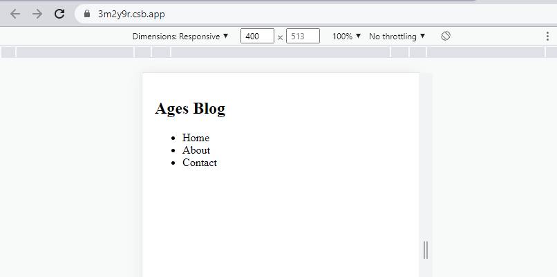
Example
In this example, we will create styled components as the styled-header.
we have use @media (min-width:768px) and return header h2.
Let’s start coding…
App.js
import styled from "styled-components";

const Header = styled.header`
  padding: 10px;
  margin: 0 auto;

  @media (min-width: 768px) {
    margin: 0;
    display: flex;
    justify-content: space-between;
    align-items: center;

    ul > li {
      display: inline-block;
      margin: 0 4px;
    }
  }
`;

const Example4 = () => {
  return (
    <Header>
      <h2>Ages Blog</h2>
      <ul>
        <li>Home</li>
        <li>About</li>
        <li>Contact</li>
      </ul>
    </Header>
  );
};

export default Example4;
Output